Overview
Kledek Manees Pro Max packaging was developed under a fast paced launch window, with the client racing to be first to market. The brief required a clear, compliant, and shelf ready design that balanced bilingual content while aligning with the client’s visual references.
Challenges
The key challenge was accommodating extensive Malay and English information within strict font size and instruction requirements, all within a tight timeline. The initial packaging approach by another designer was rejected for being overly cluttered and misaligned with the client’s direction, requiring a fast and decisive redesign.
Scope
I led the logo design, packaging redesign from layout strategy to final print preparation, including content restructuring, bilingual copy refinement, die cut planning, and precise measurements to ensure production accuracy.
Achievements
Designed a clear and scalable packaging system that improved brand perception and sales performance, catalysing expansion from a single-unit pouch to a sixpiece larger format to meet increased demand.
Logo Design and Sweet Potato Packaging
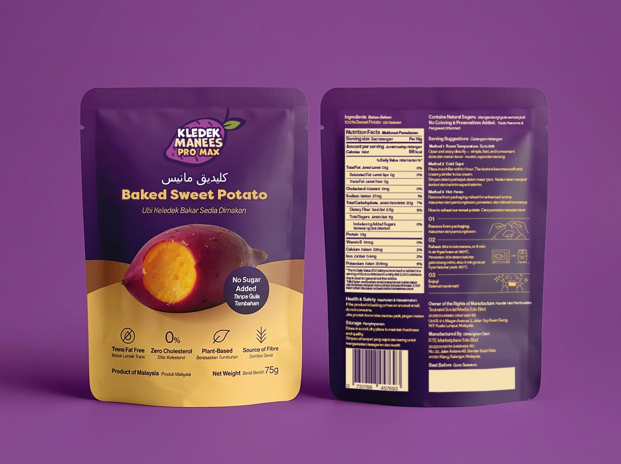
The design prioritised a clean and uncluttered front, with regulatory and product information placed on the back. The logo was designed with flexibility in mind to accommodate multiple name revisions.