Updated as of April 2026Ysfaye's Brand Journey
It was during the year 2010, in my university days, that I developed the YsFaye brand. My freelance kicked off when I was studying in the third year of my Bachelor's degree and I needed a brand. My brand keywords were:
Creative Trustworthy Professional Understanding Rebel Versatile
It was based on my character and line of work. The logo was created from the acronym of my name, YSF. Back then, 3D was all the rage. I love nature and decided to combine a flower and heart using the acronym.
 ysFaye's 2010 logo design
 ysFaye's 2018 logo design
 ysFaye's 2022 logo design
I didn't really have any brand colours all these years and just went with the flow. In 2022, I introduced more colours to the brand. Blue to represent the trustworthiness and yellow so that it appears friendly.
Although I have been told that I'm friendly, it wasn't part of my brand keywords. Yellow wasn't really my favourite colour either, blush pink is. In 2023, I decided to refresh the brand, evolving along with my own identity. I introduced the new colours, blush pink, navy and beige. I still wanted it to be trustworthy so the bright blue has evolved to navy. I prefer a subtler approach to the friendliness aspect so yellow changed to beige.
The challenges I faced when I continued to use the 3D logo were the versatility and timelessness of the design. The colours just didn't look suitable on light backgrounds, and I didn't want to use the standard black and white version. I couldn't get a logotype to fit with this logomark either. 3D in 2023 is no longer as popular as it was, and the danger with trends is that it can look dated over time.
![]() ysFaye's current logo design
ysFaye's current logo design
Being a successful person is not necessarily defined by what you have achieved, but by what you have overcome. And who you became after that.
So I created the 2023 logo, taking into account all the issues the previous logo had since 2010. I still wanted the logo to be recognisable and connected to the first logo, so the flower heart remains. The 2023 logo is when I incorporated all the brand keywords. The flower slanted to the left represents the rebel in me. The circle line indicates versatility as it's easily applicable to many platforms and situations. Pink represents creativity whereas navy, professionalism.

The colour palette utilises the new and legacy colours. Not really a fan of navy so that might change.
I've found a bit of time to refine my signature in 2025. I like how the curls represent my personality and hair in some sense.
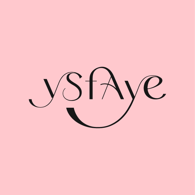 ysFaye's signature in 2025
 ysFaye's logotype in 2025
I felt both signature and logotype doesn't feel like a set even though they can be used separately. So I decided to merge both into one and came up with one that functions as both
 ysFaye's signature and logotype in 2026